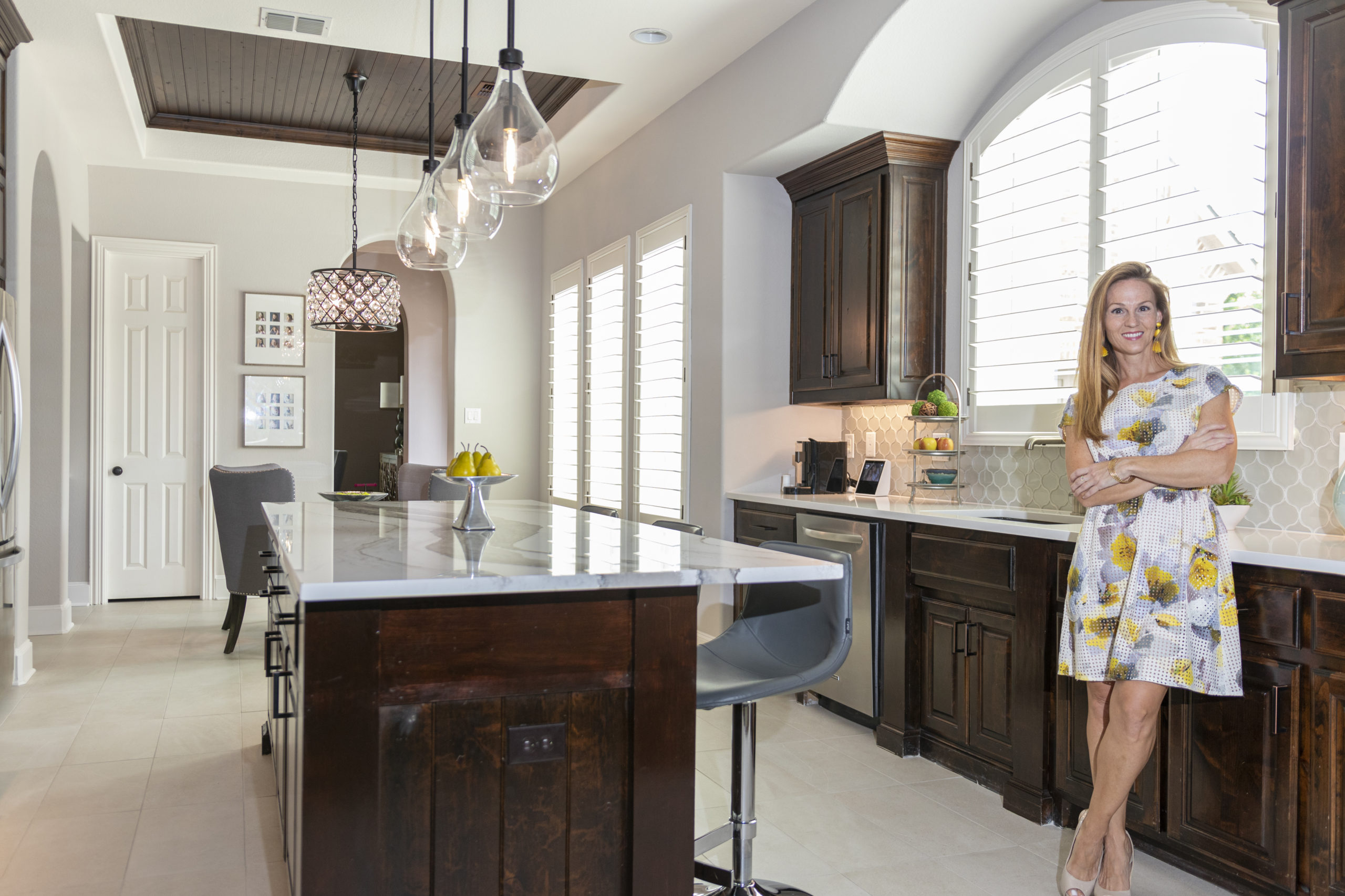
A Subtle Palette Using Pairing Cambria Quartz Styles
Whitney had been dreaming of a Pinterest all white kitchen but had original espresso-stained cabinets that she wanted to preserve. They tied into the inlaid wood in the ceiling above her eat-in kitchen, the beams in the living room and the cabinets in the office adjacent to the kitchen. Deciding to go with white, subtle cream and olive grey in the new surfaces brought out the beauty in the cabinets and is the perfect backdrop to decorate with endless possibilities.
When I first saw Cambria’s Skara Brae I fell in love with it. The veining and shades of grey, olive and black contrasted with white became the focal point of my kitchen design.
Whitney wanted the beautiful quartz on the extended island to pop when you walked into the space. To keep the countertops under the cabinets subtle, we chose Whitehall so that your eye would be drawn to the Skara Brae on the island. She loved the idea of this look so much, we decided to use it for the butler’s pantry and for the writing desk in the back of the house.
I was able to hand select the cuts so that the Skara Bare veining had a seamless flow across all 3 surfaces down the middle of my open concept kitchen and living room.
The high contrast created between the Cambria and the dark cabinets and accents flow throughout the rest of the home and compliment other design features. In these current times, the client spends more time at home than ever before and like most families, the kitchen is the hub of the home. Whitney was so glad she chose Cambria as the stunning backdrop to such an important part of the multifaceted household.
Every time I walk into my kitchen, even 8 months later, it feels so clean and refreshing. It’s a joy to cook in a beautiful kichen and not worry about having to use a cutting board or spilling something- it wipes right up.
For more info on Cambria Quartz, visit www.cambriausa.com or make an appointment to see all of the new designs at info@winstoninteriors.com